
How to Enhance Your Data Viz with Custom Tooltips
A short tutorial about how to add custom tooltips to interactive graphics in R.
Introduction
As a data scientist when making a data visualization, it is important to keep the visualization as simple as possible, while trying to convey the complexity of the underlying data. I’m sure we’ve all seen the graphics that attempt to fit as much information as possible, resulting in a jumbled mess that might look pretty, but takes a lot of work to understand. Our role as the data-viz “artist” is to keep the graphic simple, but still present all the information we feel the viewer needs to understand the data. A great way to curb our desire to add lots of information onto a graphic while still keeping things simple, is through an interactive tooltip.
What is a tooltip?
A tooltip simply, is a pop-up that displays information when the user hovers over an element. In the context of data visualization, it is a pop-up that displays information relating to the specific point on the graphic the mouse is hovering over. Lets look at some examples:
Here is a simple example of a bar chart comparing sales across different locations of a business.
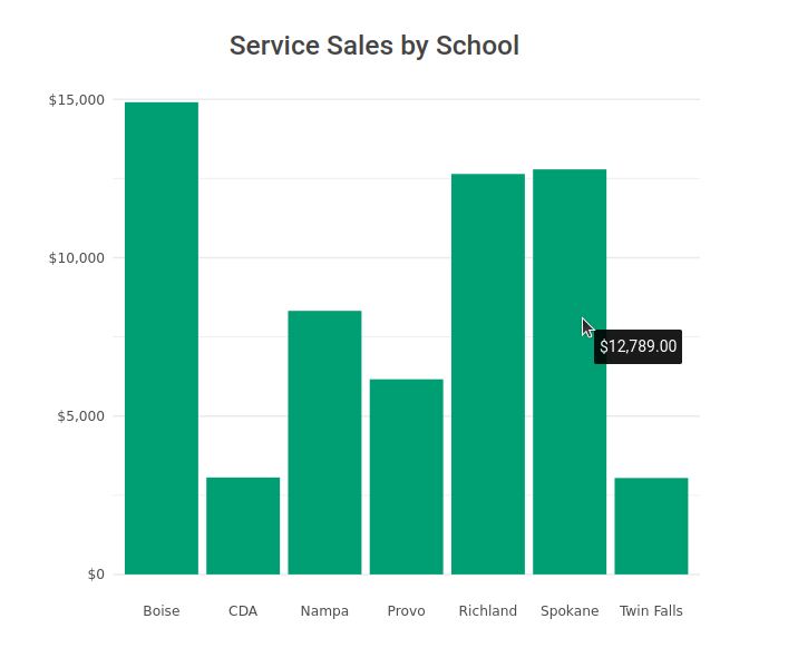
We can see generally, the differences between sales numbers. And if we want to understand the data a little more granularly, we have the simple display of the tooltip that shares the speficic sales number without putting it in front of our face the whole time.
Here’s another example with a tooltip that displays a little more information.
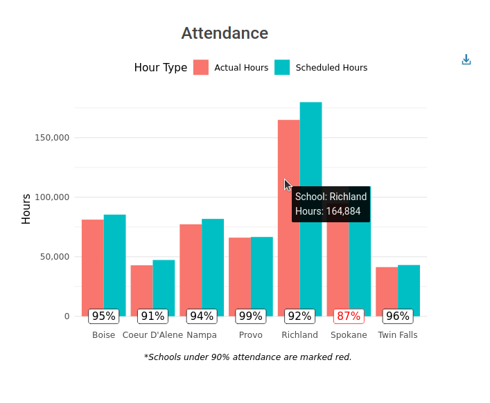
This graphic compares attendance among schools in different regions. The tooltip displays not just the number of interest, but the school as well. You get the jist…
Making a tooltip
In this tutorial I’ll use the ggplot2 and ggiraph packages in R to create our interactive graphics. Ggiraph is a ggplot2 friendly package that creates interactive graphics out of ggplot2 objects. Obviously there are many more graphing packages and interactive wrappers you could use to create an interactive graphic, but we’ll just stick with gpplot and ggiraph for now (if you’re new to the interactive piece of creating graphics, or haven’t heard of ggiraph, visit this link for more information). Let’s go through the process of creating our graphic:
1. Create your ggplot object
library(tidyverse)
library(ggiraph)
# load in data
mtcars <- datasets::mtcars
# create graphic
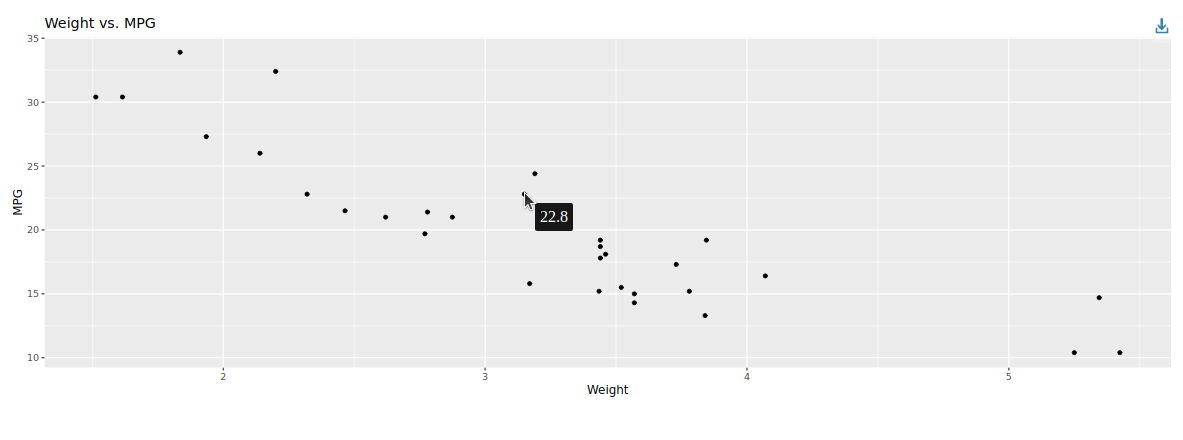
weight_mpg_p <- ggplot(data = mtcars) +
geom_point_interactive(mapping = aes(x = wt, y = mpg, tooltip = mpg)) +
labs(x = "Weight",
y = "MPG",
title = "Weight vs. MPG")
For this example, lets look at the relationship between the weight of a car and miles per gallon using the mtcars dataset with a simple scatterplot. To prepare this plot to be interactive, we use geom_point_interactive instead of geom_point. Geom_point_interactive has a tooltip parameter where we can specify the value of our tooltip. I’ve specified it as mpg, the y-axis variable of the scatterplot.
2. Make it interactive
library(tidyverse)
library(ggiraph)


# load in data
mtcars <- datasets::mtcars

# create graphic
weight_mpg_p <- ggplot(data = mtcars) +
geom_point_interactive(mapping = aes(x = wt, y = mpg, tooltip = mpg)) +
labs(x = "Weight",
    y = "MPG",
    title = "Weight vs. MPG")

girafe(ggobj = weight_mpg_p,
    width_svg = 15)
To make it interactive, we need to wrap the girafe() function around our ggplot object (I’ve specified the width just to make things look nicer in Rstudio).
And thats it!
We can see from the graph below that we have a simple scatterplot with a tooltip that displays mpg on the hover of the mouse.
3. Customize
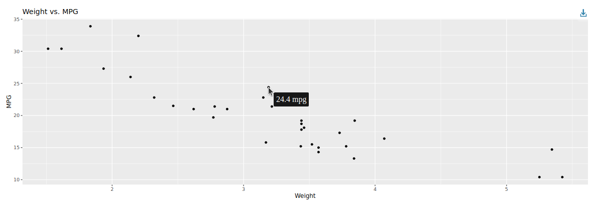
But what if we wanted to add some more information to our tooltip? There’s a chance our user doesn’t know that the data in the tooltip is the mpg. Let’s fix it by making our tooltip display “x mpg”, x being the mpg. In order to do this we need to go back to our data. The tooltip argument can take in any variable in the dataset we pass into ggplot(). So we can create a column in our dataset that has the string “x mpg” with a simple mutate statement. We then pass that new variable into the tooltip argument.
mtcars <- mtcars %>%
mutate(mpg_tooltip = paste0(mpg, " mpg"))


# create graphic
weight_mpg_p <- ggplot(data = mtcars) +
geom_point_interactive(mapping = aes(x = wt, y = mpg, tooltip = mpg_tooltip)) +
labs(x = "Weight",
    y = "MPG",
    title = "Weight vs. MPG")

girafe(ggobj = weight_mpg_p,
    width_svg = 15)
And that’s it!
Let’s make the graph a little more interesting by adding the number of cylinders as a color aesthetic and add it to the tooltip. Here I use “\n” in the paste0 function to add a newline onto my tooltip.
mtcars <- mtcars %>%
mutate(cyl = as.factor(cyl)) %>% # cylinders as a factor
mutate(mpg_tooltip = paste0("Cylinders: ",cyl, "\n",mpg, " mpg"))

# create graphic
weight_mpg_p <- ggplot(data = mtcars) +
geom_point_interactive(mapping = aes(x = wt, y = mpg, color = cyl, tooltip = mpg_tooltip)) +
labs(x = "Weight",
    y = "MPG",
    title = "Weight vs. MPG",
    color = "Cyllinders")

girafe(ggobj = weight_mpg_p,
    width_svg = 15)
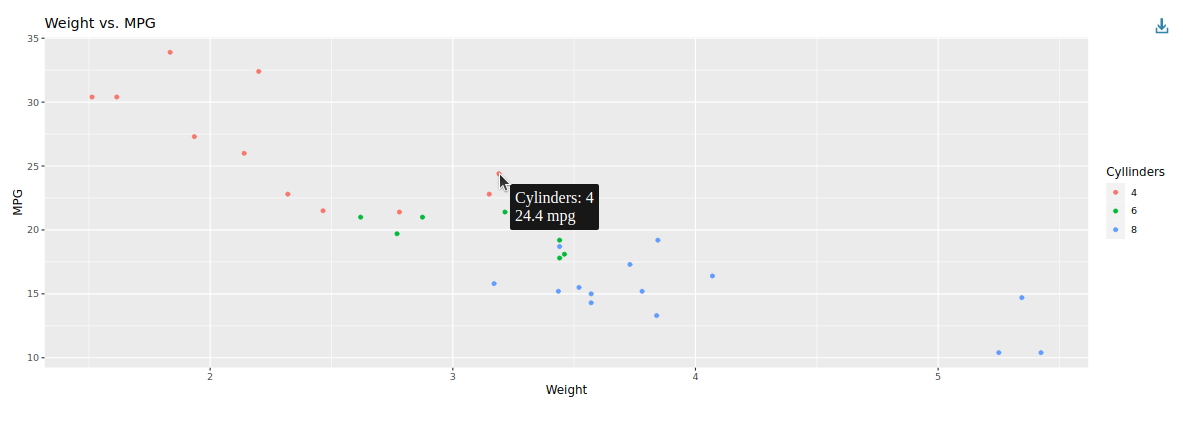
With the concept of creating our own string from the dataset, we can create a custom tooltip that displays any of the existing data we would like.
Conclusion
In this tutorial we went through the process of implementing a custom tooltip onto a ggplot object using ggirpah. With this tool, you can keep clutter out of your graph but still give your viewer the data they need. So for your next data viz, keep things simple and try a custom tooltip.